PC optimun Redesign
- Role: UX Researcher, UI/UX Designer
- Type of project: App redesign
- Tool: Figma
- Team: Ellen C., Esther H.
- Duration: 2 weeks
Overview
As a customer of Loblaws, Ellen found the reward system of Loblaws is pretty good however the app makes her frustrated. She always misses the offers she likes and it’s hard to find the offers she needs. So we decided to find a way to improve PC optimum app based on what we learned from school. Since we don’t have much time, we decided to focus on the Weekly Offer of Your Offers page first.
Problem Statement
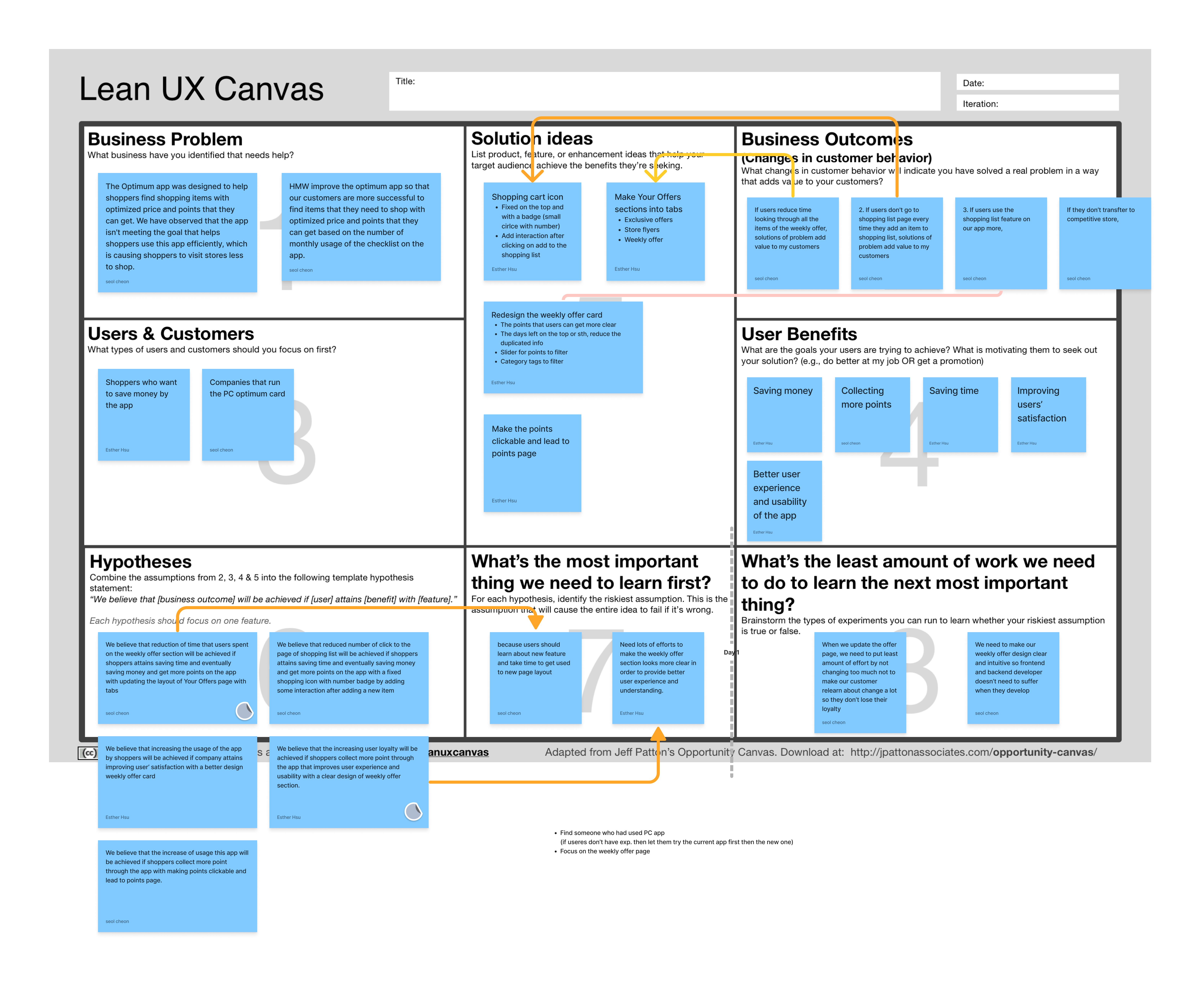
Lean UX Canvas
Problem
The Optimum app was designed to help shoppers find shopping items with optimized prices and points they can get. We have observed that the app isn't meeting the goal that allows shoppers to use this app efficiently, which is causing shoppers to visit stores less to shop.
HMW
HMW improve the optimum app so that the customers are more successful in finding items that they need to shop with optimized price and points that they can get based on the number of monthly usage of the checklist on the app.
Original Design
Problems & Ideations
Idea #1: Layout (A)- Make Your Offers sections into tabs
- Fix the icon on the top with a badge
- Add interaction after clicking on add to the shopping list
- Make the points clickable and lead to points page
- Remove the duplicated info
- Make the points that users can get more clear
- Add a filter and sorting function
- Add alarm function
- Delete button by section
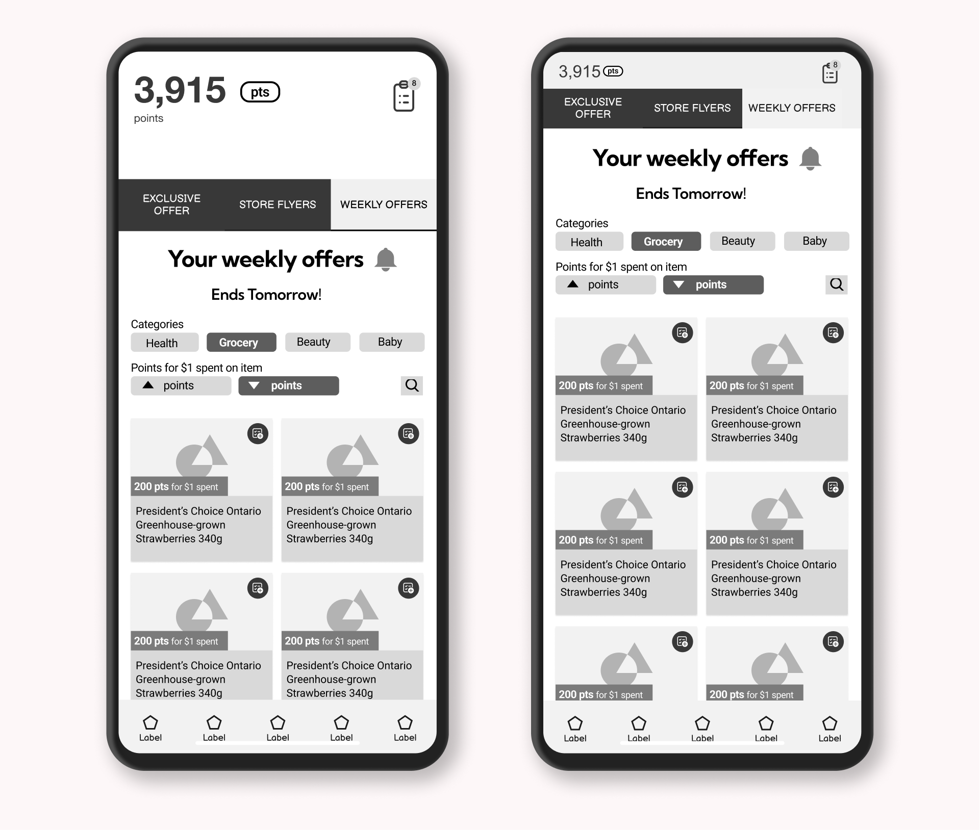
Low-Fi Design
GOAL #1
Make it easier to see Weekly Offers by redesigning the layout into tabs so that the feature will add value to users. Also, add a set offers alarm button, increasing the chance that users use the app weekly.
GOAL #2
Increasing users' engagement by simplifying the product card and shopping list feature so users can collect more points by the quality and save more money. A filter and sorting function to help users to find the offers they like quickly.
Usability Testing
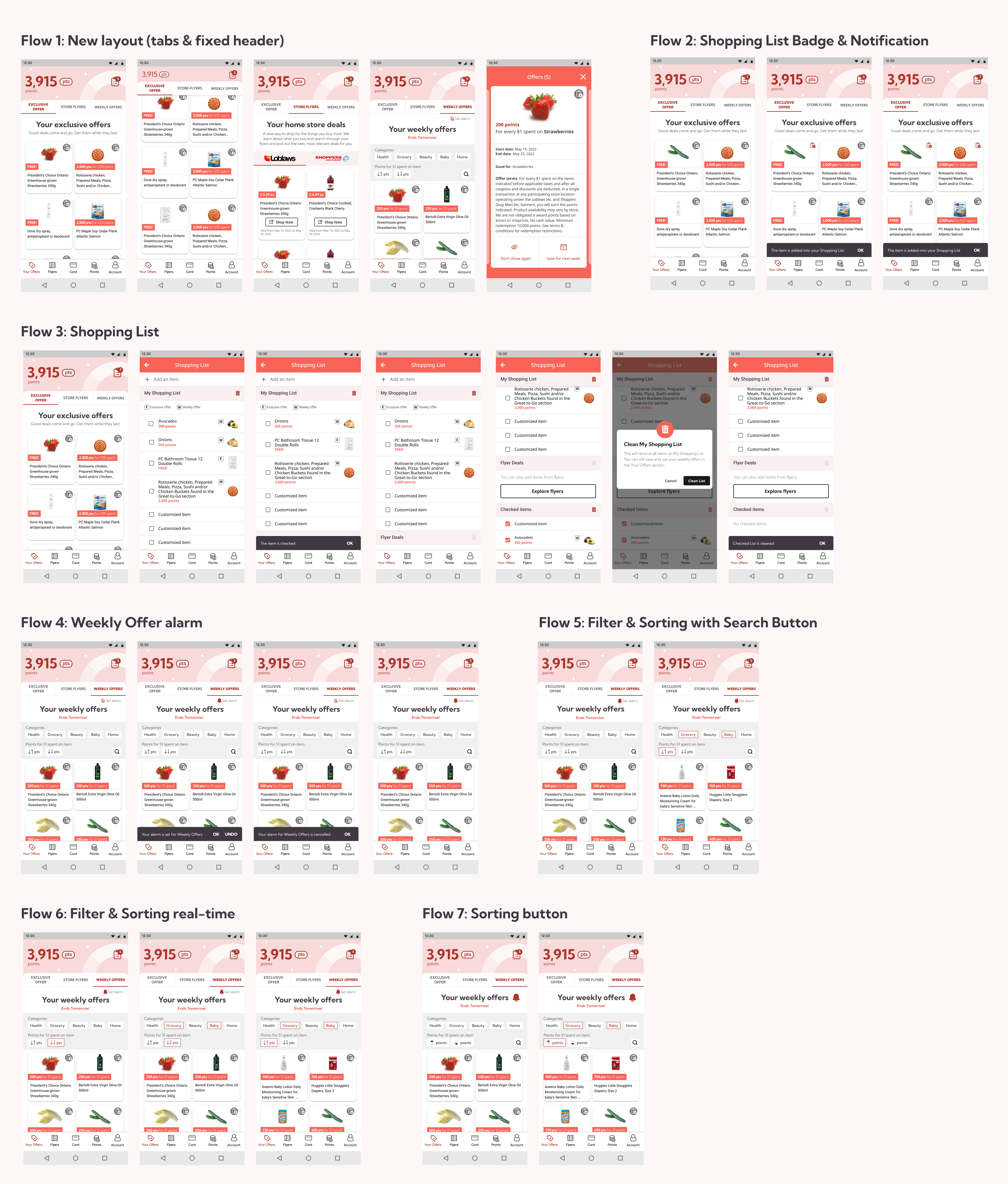
User Testing Flows
Findings
- The overall experience can be more interactive
- The Shopping List badge with the number is a good idea, but the number seems a bit too small
- For filtering and sorting, the real-time one makes more sense but the sorting icon is still confusing
- Two columns of product cards seem a bit heavy visually
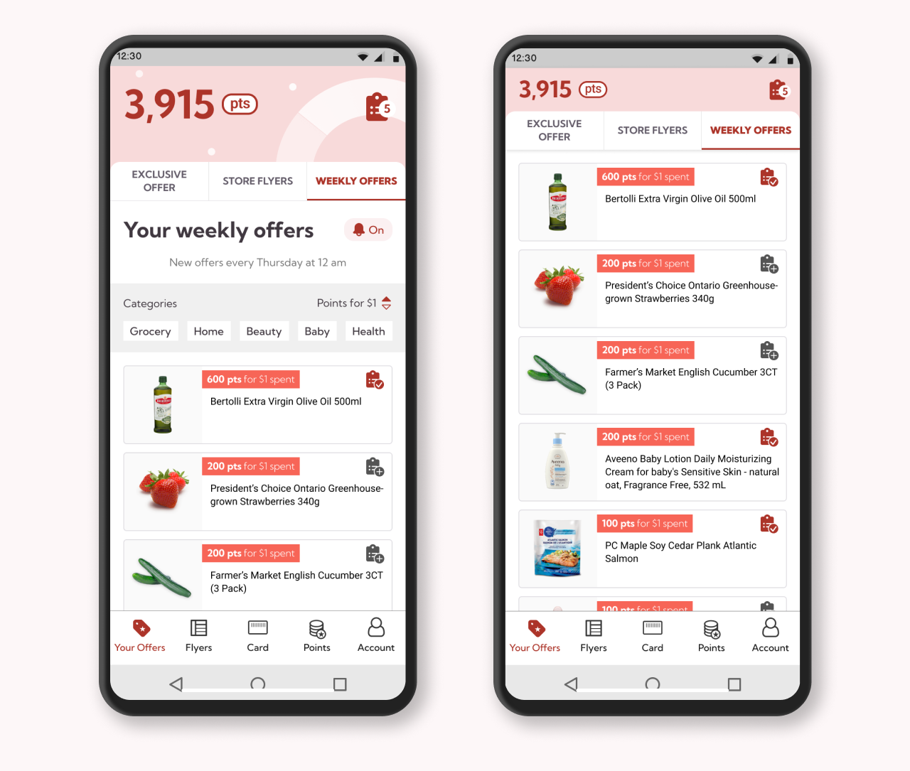
Solution
Conclusion
What did I learn?
Make the rewards system as simple as possible! Users want to earn the rewards without effort besides spending money on it.
What could I improve or do more?
Redesign the onboarding experience since there are too many different offers.


