AFDS Redesign
About AFDS
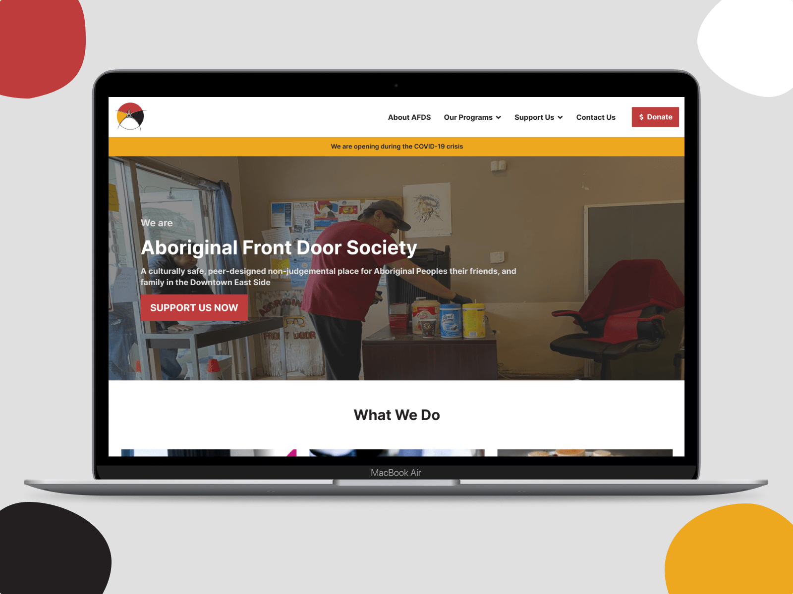
Aboriginal Front Door Society(AFDS) is a culturally safe, peer-designed non-judgemental place for Aboriginal Peoples their friends, and family in the Downtown East Side. They create hope and offer support through Aboriginal cultural traditions, caring, and acceptance.
Esther
I heard a lot about First Nation before coming to Vancouver, and after I got here, I heard a lot about the people in downtown east side. So when I knew that I could choose either an NGO or a local business website to redesign for our final project, I decided to go for Aboriginal Front Door Society (AFDS).
Design Process
Problem Statement
Research and user interviews
Design
Concept
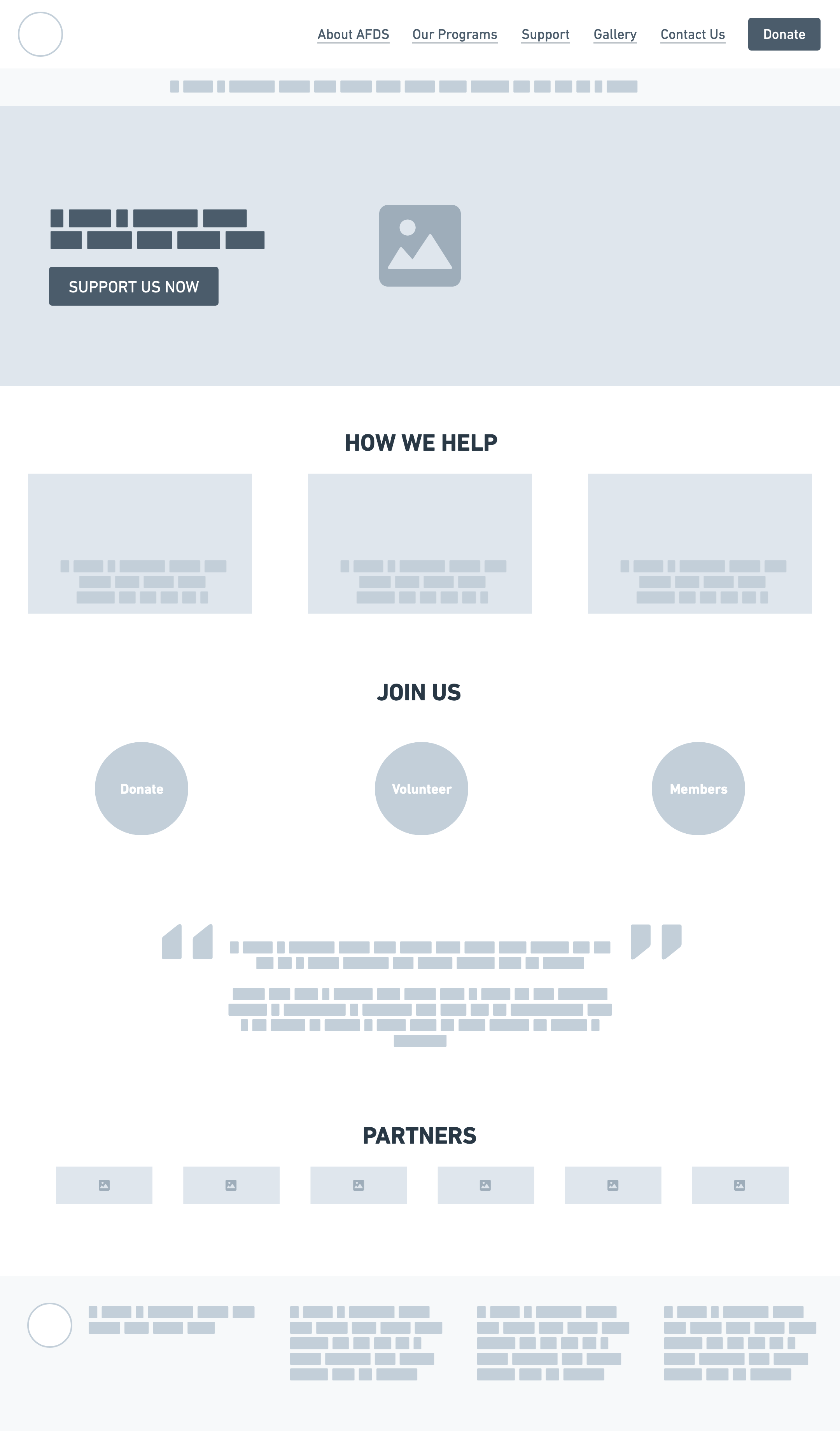
Sketch and low-fidelity design
Usability
Testing
Test with low-fidelity & high-fidelity prototype
Final
Solutions
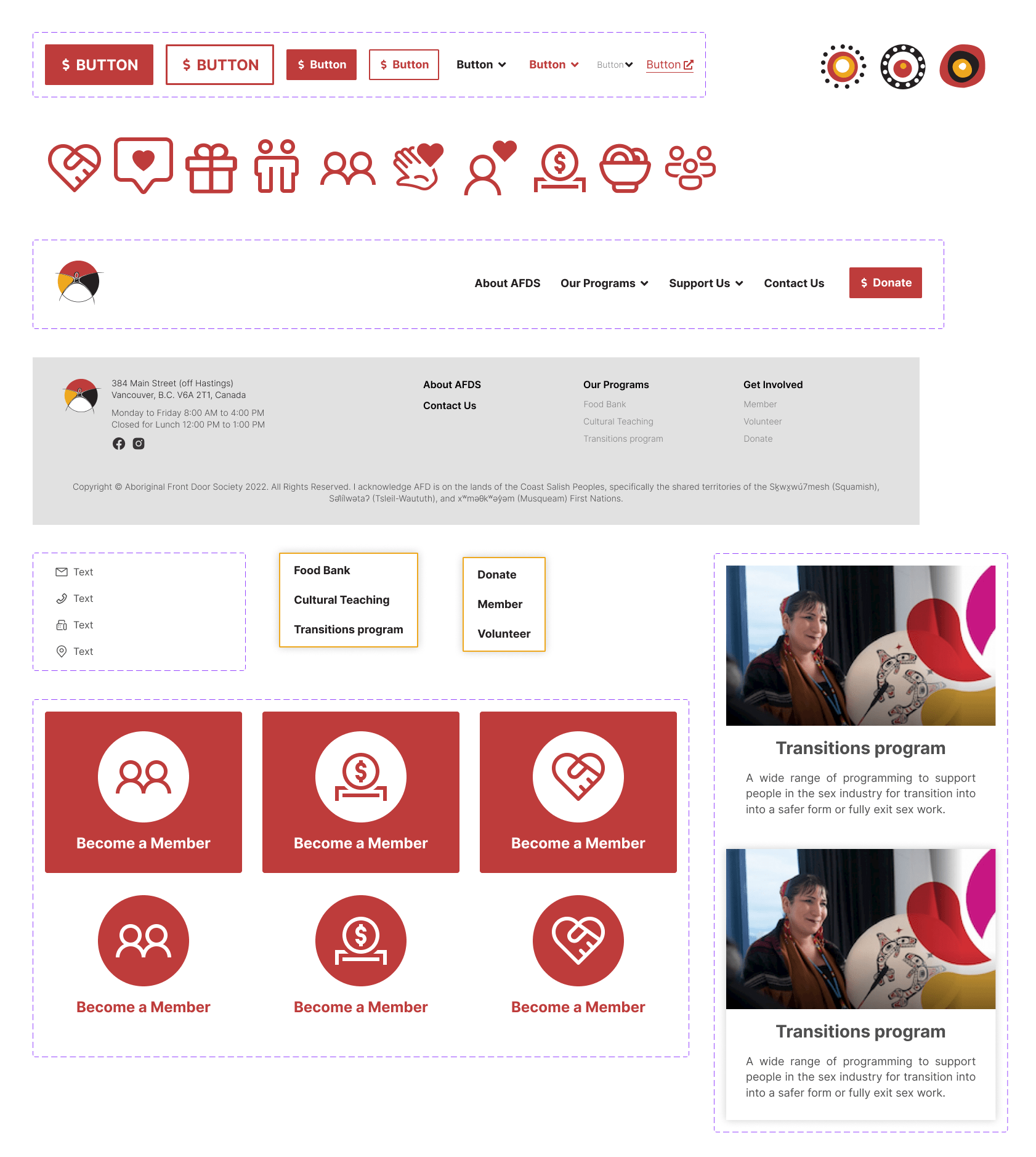
Final design and solutions
Problem Statement
Problem
An ideal NGO website should help people to learn more about the organization and make the decision on donation. According to the current AFDS website, it seems that it didn’t reach the goals of an NGO website.
Users Interviews
Findings
- Authenticity is essential
- Multiple payment methods are important and also increase the trustful
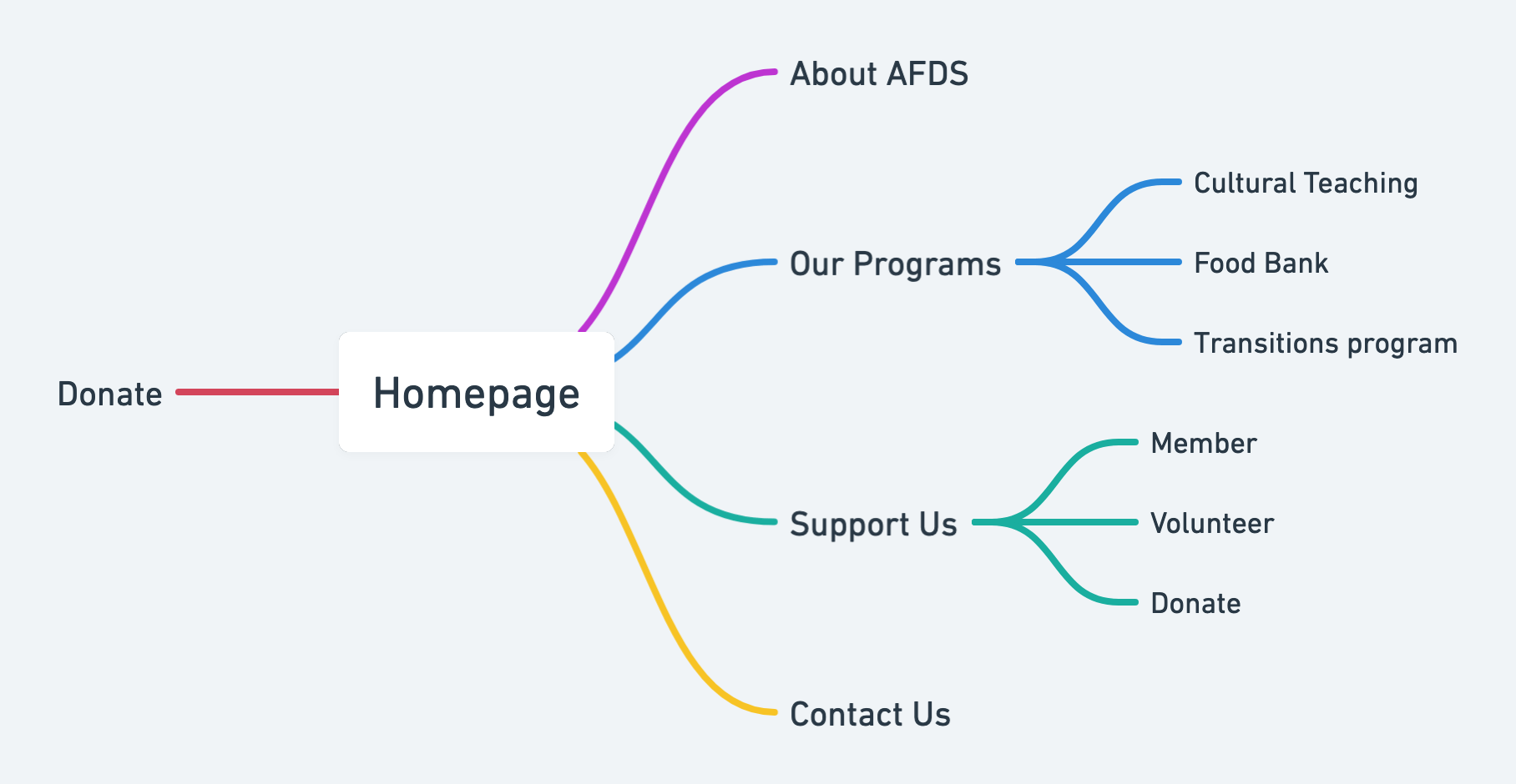
- It’s not easy to find out what AFDS is doing from the website
- Overall content is too wordy and it’s hard to find the important information at the first glance
- The topics/field of the NGO matter to the users!
- Show the transparency of AFDS, like words from the people they help
HMW
HMW improve the AFDS website so that people can learn more about the organization and even help them to make a donation based on the information they get on the website.
Design Concept
Usability Testing
Low Fidelity Testing
Since it's an NGO website, I chose to focus on the Donation Flow for the usability tests.
After interviewing 3 participants, I got the most important finding -- Users want to know more about how their donation could help.
Solution
Adding more information about how donations will help on the donation page
High Fidelity Testing
For high-fidelity testing, I chose to test with the two task flows and here are the findings:
- Information on the homepage is clear and structured enough, but some pages are still content-heavy and might need more space
- A financial table may help donators to decide the amount to donate
Solution
I agreed that a financial table showed the transparency of a NGO, however, since I couldn't do anything about it and didn't have enough time for copywriting, I just added some space for those text-heavy pages.
Final Solutions
Conclusion
What did I learn?
The AFDS website is a content-heavy one, and I understand that as an NGO, they have lots of stories want to tell. But I think it's also essential to consider the users. Telling a story is a great way to brand, but how to tell a concise story is even more important.
What could I improve or do more?
If I had enough time to work on this project, apart from the copywriting, I think I would like to go to AFDS in person and know them more. Also, digging a bit deeper into the donation platform in Canada to see how it works. Maybe I would come up with other solutions to improve the donation process.


